QWINN Business Partners
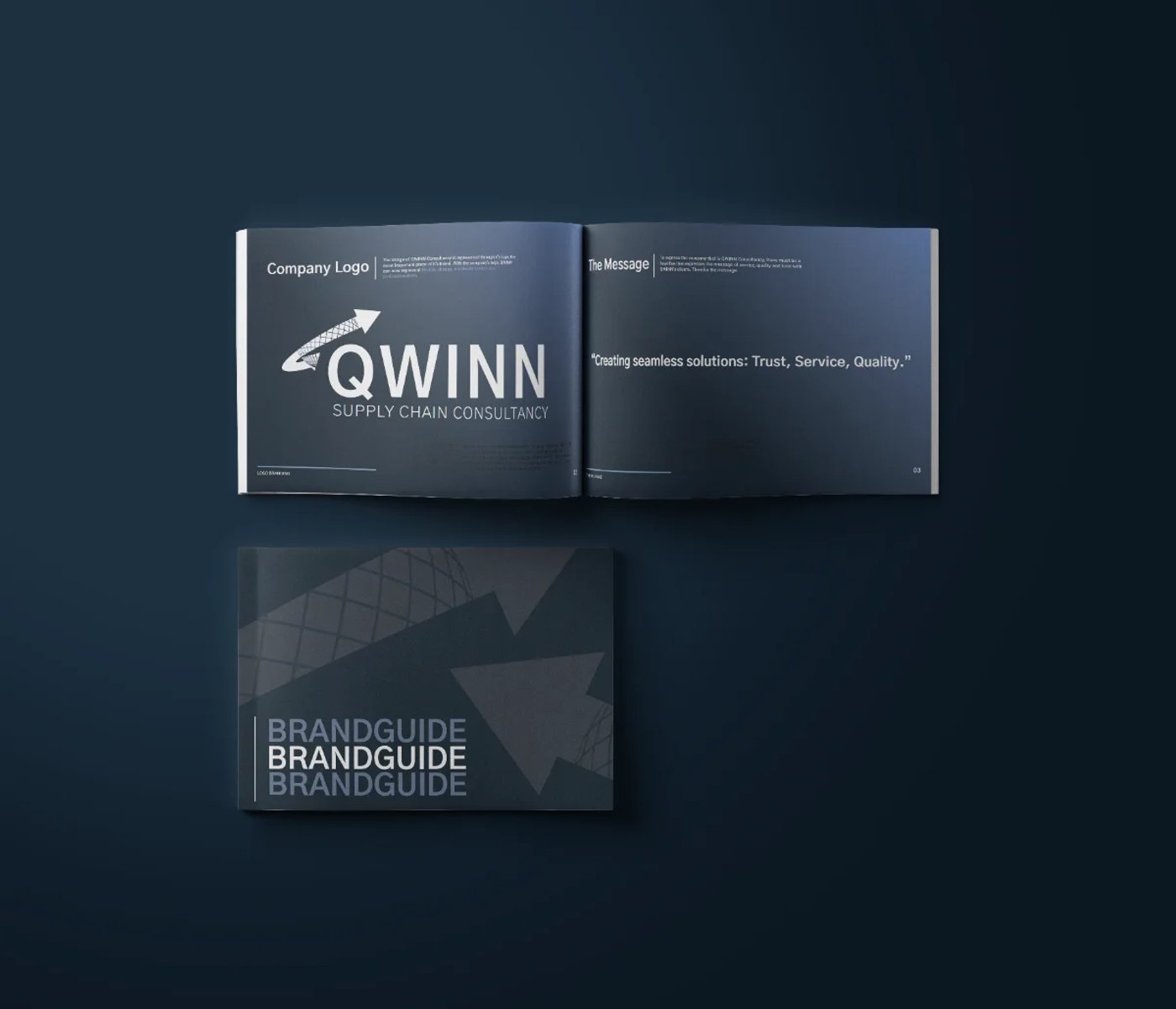
A visual identity for a supply chain consultancy — then a rebrand, evolving the mark from Qwinn Consultancy to Qwinn Business Partners without throwing away what people already recognised.
Qwinn turns supply-chain strategy into results — optimising processes, building resilience and acting as an extension of their clients’ leadership teams rather than outside advisors. I was brought in to give that expertise a face.
The challenge
Then the company rebranded — Qwinn Consultancy became Qwinn Business Partners — and the existing logo no longer matched the name above the door. The new name signalled a shift from advisor to strategic partner, and the mark had to follow. But the original identity already carried real recognition with existing clients. Starting from a blank page would have thrown that equity away; the brief was to evolve, not erase.
Our approach
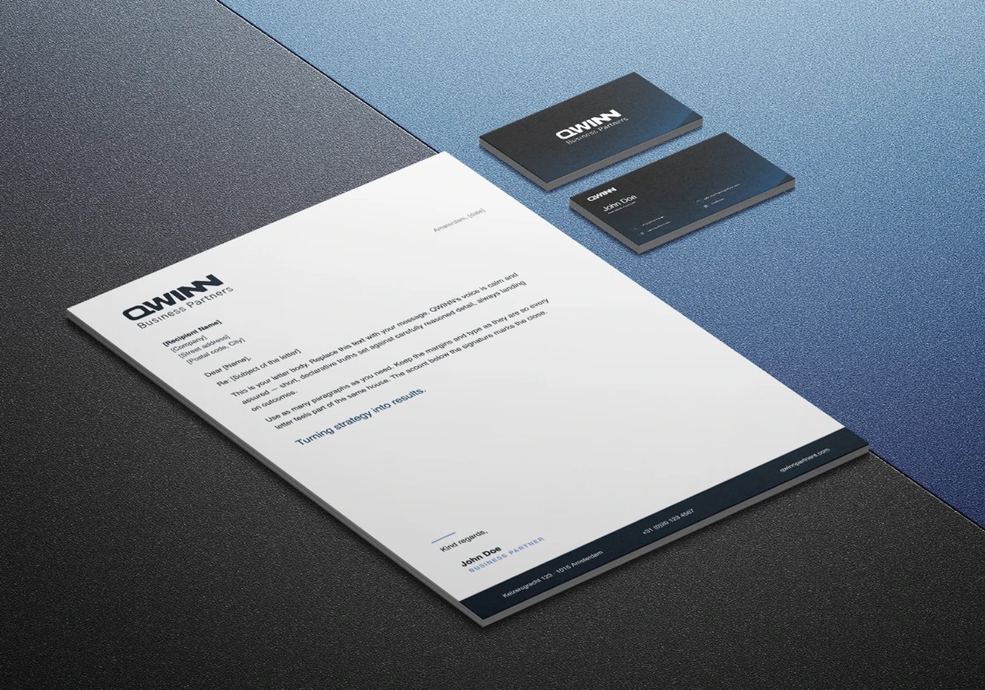
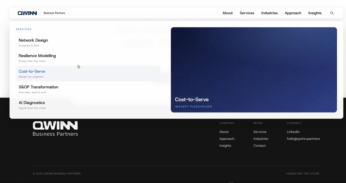
Evolve the language, don’t replace it. Building on the identity created for Qwinn Consultancy, I redesigned the logo to fit the Qwinn Business Partners name. By carrying the original visual language forward rather than discarding it, the brand keeps its continuity while better reflecting Qwinn’s position as a strategic supply chain partner — the same Qwinn, levelled up.